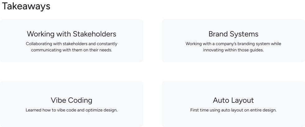
Redesign of Zippy’s News Section & Templates with a focus on hierarchical structure building, aligning old design with current branding system, and ensuring accessibility.

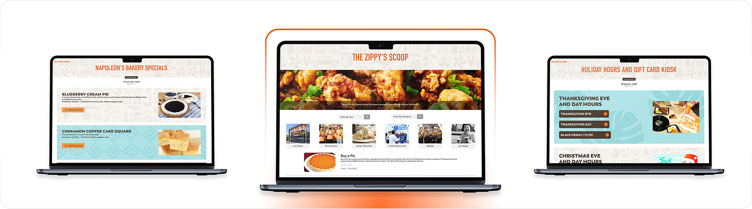
Zippy’s is Hawaii’s Diner of Choice:
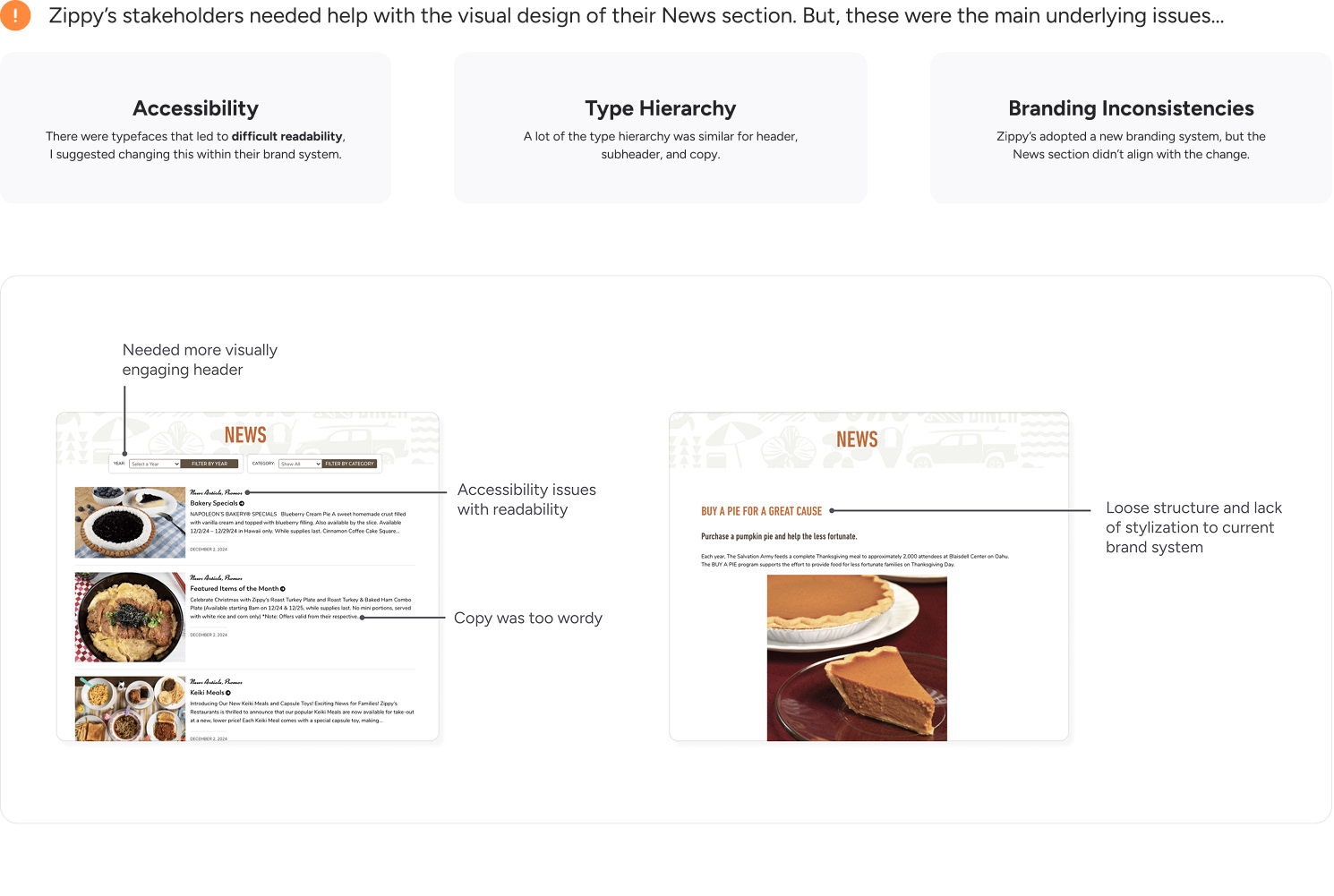
Their target market is of all ages, but mainly targeting: families, locals, and tourists. Considering this, accessibility is very important, along with fostering a welcoming environment.
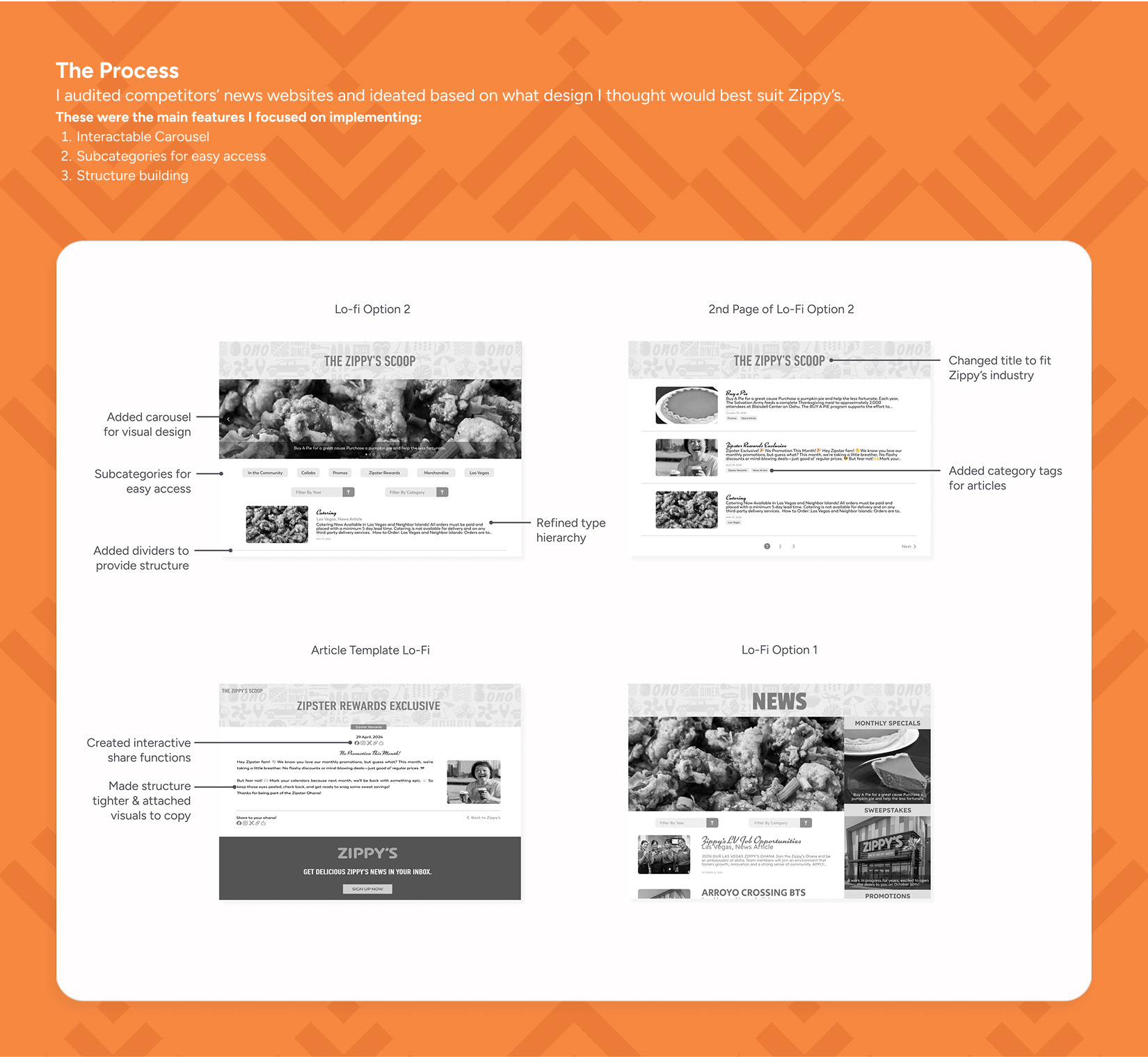
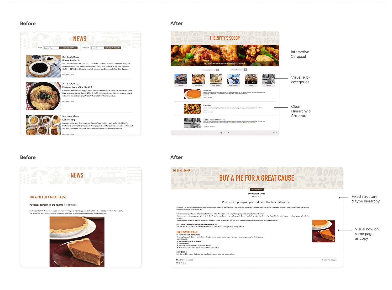
So, I came up with a solution to further visual engagement and usability.
• Adding a carousel to push visual interactivity
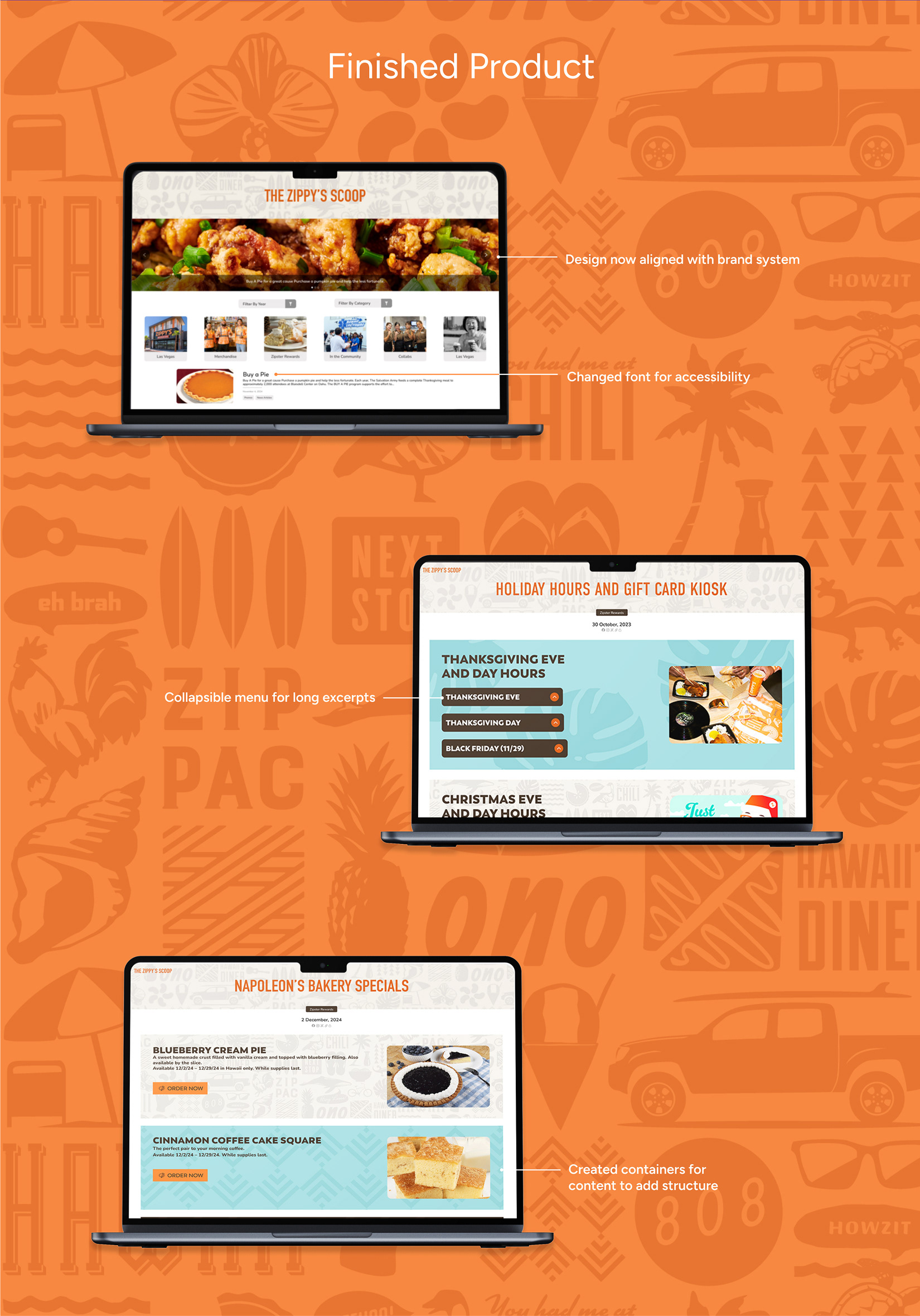
• Creating drop down menus for long paragraphs
• Aligning design to the brand system
• Creating tighter & clear visual hierarchy
Then, I built the page using auto layout and vibe coding with builder.io, but it wasn’t working how I thought...
• Auto layout was not concise & simplified before
• Many glitches with the image frames
• Components were distorting
I fixed it by doing this:
• Making all frames hug length and height
• Ensuring there wasn’t extra auto-layout frames
• Auto-laying out everything from the top to bottom
Reflection
It was a bit challenging at the end when preparing it for development, given I was only in the role for 3 months.
But, overall it was a great experience collaborating with Zippy’s and being able to offer my perspective on how to improve their website’s user experience design
But, overall it was a great experience collaborating with Zippy’s and being able to offer my perspective on how to improve their website’s user experience design